
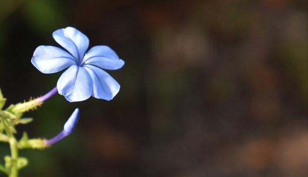
Color of the year: I’m so blue (not really). Pantone just announced the Color of the Year for 2022, and it’s . . . Very Peri. Speaking technically: PANTONE 17-3938. I’m a little bit sad because Ultimate Gray (the 2021 color) and I are getting along famously and I don’t want to break up just yet. I don’t love Very Peri, at least not yet. It’s very deep and cool. (Like us, so that’s good.)

I must sound like a serious Scrooge, because the Pantone people say this about Very Peri: “Displaying a carefree confidence and a daring curiosity that animates our creative spirit, inquisitive and intriguing PANTONE 17-3938 Very Peri helps us to embrace this altered landscape of possibilities, opening us up to a new vision as we rewrite our lives.” And I am all about curiosity, creativity, and intrigue!
“I try to apply colors like words that shape poems, like notes that shape music.”
-Joan Miro
I don’t take this whole color of the year thing too seriously, as I wear a small, mostly neutral color palette and can always find something I like. And I shop frequently at thrift and consignments stores, so I am buying the Colors of Years Gone By.
But does this mean my favorite shops and online catalogs will be brimming with purpled-blue for the next twelve months? Sheets, coffee cups, iPhone cases, rain boots? Eye shadow, cars, lamps, and curtains? My wardrobe is content with neutrals and a few shots of color, and for home decor I favor warm vivid colors like gold, teal, and warm red.
Here are some small ways I might play with the newly annointed color:


“I’m a drag queen. I want colors that get attention. The world does not need another palette with eight tans and a blue.”
-William Belli


What’s your reaction to Very Peri? Does it make you feel blue or uplifted?
Not Dead Yet Style will be “off” next week so we can recharge and refresh, and splash our faces. ☺ Wishing you all the happiest of holidays!
Stay fabulous, xo

Wear what you love, always. Here are some goodies to browse:

Please be aware that links to vendors may be affiliate links. I may benefit from your purchases through the links on the blog. Header photo by Julie Blake Edison on Unsplash.
ok fun is an online platform that provides entertainment content, including videos, live streaming, and interactive features. It is designed to offer users an easy and engaging way to enjoy digital media anytime, anywhere.
vibet88 is an emerging online platform that offers users a dynamic and engaging digital experience. Known for its modern interface and user-friendly design, Vibet88 provides easy access to a variety of online services, making it popular among users looking for convenience and entertainment in one place.
789club.zone is an online gaming platform that offers a variety of exciting casino and slot games for players. The platform features a simple and user-friendly interface, allowing both new and experienced users to easily enjoy different games such as slots, card games, and fish shooting games.
99win.com is an online gaming and betting platform that offers a wide range of casino games, sports betting options, and live dealer experiences. It is designed to provide users with a smooth interface, secure transactions, and attractive bonuses, making it a popular choice for entertainment and real-money gaming.
thank you
rg9ein
30n9gm
yhgk4b
0sn240
ubsu56
f57mat
g4ejc7
vgtlau
60kqjl
rov0na
2if891
ehv2kz
f0qkqo
ok fun is an online platform that provides a smooth and enjoyable digital experience. It offers easy access, fast performance, and
a user-friendly interface for users on any device.
i5btk2
3ksvfb
xy0ix7
tx5m79
sdj4kb
0176hd
sslqbx
s3zvri
508hw6
2kbcka
bwrgsj
hubhkt
wckhe6
68p613
65h1z8
8pwyye
c74akm
f7wujl
6etenz
szmgyi
qs1v4g
a7h0fb
That’s a tough shade to wear for a lot of people – the very cool undertones will clash for many with their skintone. I love the idea of wearing it on the nails or a brooch, Patti!
ohyh50
64eek2
2t146o
its one of my favorites.
68sh7h
7sq7au
I like any shade of blue although I agree with one of your readers who said this is more of a purple shade than blue. I like purple shades too, though, so I’m a happy camper. I’ll look for what I already own in my closet that fits close to Peri. Merry Christmas!
Good morning Debbie and thanks for coming over! Happiest holidays to you and stay a “happy camper” : > xx.
I still waffle between all shades of black and gray and more vibrant colors like red an orange. It’s a war for my soul! Peals of laughter here! I do like Peri. Perhaps, I’ll give it a try.
Happy Holidays!
Hello Rebecca and happy holidays to you. i love that expression – colors are waging “a war for your soul.”! Have a wonderful weekend and stay fab, xx.
It’s a pretty colour, but I don’t pay much attention to whatever colour Pantone deems to be the “colour of the year”. I hope you and Sandy have a lovely Christmas.
Thank you dear Shelley, and I hope your holiday is bright as well. Stay fab, xx.
I tend to wear a lot of neutrals but I have always been drawn to blues and periwinkle in particular. really one of my favorites.
Hi Darby and thanks as always for coming by. Enjoy your blues, and have a very happy holiday, xx.
That’s a tough shade to wear for a lot of people – the very cool undertones will clash for many with their skintone. I love the idea of wearing it on the nails or a brooch, Patti!
I’m still trying to wear as much colour as possible – it’s so cheering.
A very Happy Holidays to you and Sandy, Patti!
Oh hey Sheila and Happy Holidays! Rock on with your colorful self, and have a merry weekend, xx.
That quote describing color to language of a poem and notes in music was such a beautiful thought thank you for sharing it. I adore the color blue and will be wearing shades similar to items in your goody selections rather than Peri .Your Miro quote reminded me of a stylist who advised creating a capsule wardrobe using color combinations of a painting we liked . I particularly liked her wardrobe based on Gustav Klimt and a work by Dali that inspired a capsule with a light blue ,light beige ,white and soft gray which I currently still have for next Summer.PS can’t wait to get that new Lip Gloss goody thanks for the tip.Hope you and yours all have the Happiest of holidays.
Hi Joan and thanks so much for coming by and sharing your thoughts. The artistic color combination you reference sounds lovely. Have a most happy holiday, xx.
Blue has become my new favorite color the past few years. I love different soft shades of green but noticed as I got older they didn’t suit me or go with my skin tone so I switched to blue. Periwinkle is not my favorite blue, but I like it.
Hello Louise and thanks for coming over. Wishing you a very happy holiday and sending good thoughts! xx
I like periwinkle but being blue, it might be close on the color wheel, but not quite there. I like the specs you highlight. I am in the market for a new pair of glasses so who knows?
Have a fantastic holiday Patti, looking forward to your posts in 2022.
A fabulous holiday is wished for you too, Tami and I will see you next year! Take good care and enjoy every day, xx.
I don’t see it as blue at all – it’s very much purple – in fact, I have an old button pin in that color I am going to pop onto my denim jacket right now! Merry Christmas!
BTW – I don’t love it but I don’t hate it either. It is what it is!
Hi Monica and thanks for coming by! Merry Christmas to you and your loved ones, and stay fab, xx.