
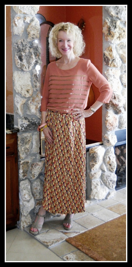
I rarely wear any coral, peach or orange near my face. But I do like this soft hue in a sheer summery top I thrifted while on vacation. It doesn’t compete with my skin tone or wash me out. I still prefer one of my cool colors like blue or green but it’s good to spread my color-wings once in a while.
The skirt is a vibrant geo print maxi I found at a local consignment store (before my shopping diet!) for $12. It’s by FLAX, a good old retro brand that I used to love in my 30’s. They print upbeat slogans on their tags, and this one says: “Have an attitude of gratitude.” It’s light as the breeze and I plan to wear it a lot for work and play.
 |
| Not my most-beloved colors, but an inexpensive foray to the warm side. |
Our weekly link-up, Visible Monday, starts Sunday evening and parties on through Monday. All are invited to participate!
Have a fun-filled weekend!

The general theories about colour would say that either bright white or shades of cream would suit you. i.e. I suit bright white, but not yellowy cream. My redheaded friend suits cream but not white. From memory, I think all the the 'season's' have some sort of pale shade that supposedly suits them. Is is more about how you're wearing them i.e. would a different outfit/ acessories perk things up?
Found a possibly interesting link for us all as we're talking about colours… http://www.thefashionspot.com/life/177555-color-theory-learn-which-colors-look-best-your-skin-tone/
Nice colour! I'm a 'winter' i.e. dark hair, pale skin so some warmer shade of peach/ coral etc don't suit, but there's always a shade that you can get away with. You look pretty in the one you chose.
patti you look so super cute! patti would you mind if for visible monday i carry on linking my previous week's shiny t tuesday post (even though now it's also a linky)? xxxx
I love long print skirts! Yours is perfect. The whole outfit really looks great on you–especially the mix of stripes and a print. Thanks for the inspiration.
This peachy color is so pretty on you. The skirt is so fun!
Alice
http://www.happinessamtidlife.com
I still love Flax — loving the linens forever.
Super cute, and the color looks very nice on you.
This is an informative post review. I am so pleased to get this
post article and nice information. I was looking forward to get such a post
which is very helpful to us. A big thank for posting this article in this
website. Keep it up.
damenfrost.com
I like the combination with the gold stripes and the print of the maxi. And this reminds me, I need to get some nude sandals!
My favorite of your outfits … hands down. Really lovely.
I'm kind of so-so on the top, not because of the color, but the fit, which might be a little big?
I like the skirt which I think will find it's way into many an outfit. As someone who owns two brown silk sweaters I'd love to have that skirt!
Yes, this deeper shade works well with your skin tone.. well done and love the phrase on the skirt tag! of course… that makes sense since I end my blog posts with daily gratitudes
This outfit just proves it's useful to experiment with colours we don't usually choose, as these peachy/orange tones really suit you, Patti. Love the gold stripe detail on the top, and of course you know I love a maxi with a bold print! You look gorgeous! xxx
Wow Patti, you look amazing in this outfit.
This is a strong peach, which suits you well. Anything paler would be very washy with your delicate skin tones … J
what a pretty top! love the color and the bling!!!
You look great! I can do peach. Creams, ivories, whites are so terrible on me and I LOVE them UGHH!
Very flattering! Looks cool and comfortable, as well.
It's actually a lovely color on you!
Love the print of that skirt, very fun and vibrant!