
Welcome to Visible Monday #33! If you want to participate, it’s so easy: just go to the bottom of this post for the simple how-to.
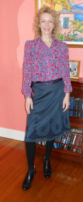
In the spirit of Visibility, I reached for a very vibrant blouse today. I like a lot of things about it: the subtle ruffles at the neck (hard to see here), tiny puff at the shoulder and cuff, and easy drape. I believe the colors are too vibrant for my very fair, low contrast coloring though. I applied my usual amount of makeup, and I look a little washed-out here. I want to add some blush and lipstick, and that’s a sign that the colors I’m wearing next to my face are not ideal.
I do adore this Old Navy skirt, thrifted a couple of years ago, and down to about 25 cents per wear. I noticed that one of Sandy’s ties made a lovely almost-fit with the blouse, and he was kind enough to tie it man-style around my waist (that was fun!). Tights and trusty Sofft booties completed the look.
 |
| Blouse and skirt: thrifted; Husband’s tie as belt; Sofft booties: thrifted |
 |
| I still have not learned this knot – have you? |
I can’t wait to see what you are wearing today!
The guidelines to participate in the Visible Monday Link-Up are so simple!
- Any Monday, whoever wants to can join in! Just compose a post that includes any outfit, accessory, piece of jewelry, hairstyle, cosmetic or other adornment that makes you feel more confident, alive and visible that day.
- Include a link to Not Dead Yet Style somewhere in your post.
- Go to the bottom of this post and click on this cute little link:

In the “Next Step”, you crop the pic (easy tool) you want to display, and you’re done!
document.write(‘
The tie as a belt is so inspiring, dear Patti.
Besos
XXXXXXXXXXXXXXX
love your blouse so much. the print is amazing.
http://wardrobexperience.blogspot.com
'Found your blog from The Pleated Poppy and love it! There are days my wardrobe feels anything but cute! Thank you for a lovely blog with lots of fun ideas! -Marci
I'm really getting into pattern at the moment – so I love your blouse, and cute boots!
I love the blouse and tie together – they look awesome, and such great colours on you!
I can certainly tie a men's tie – I can even do a double-Windsor knot. It's not that hard. 🙂
Hi Patti!
Made it this week!
Lovely outfit you are wearing, i am crazy about the skirt!
Patti,
what a fun visible-Monday this once again is! I did not expect myself to say this, but I like the signature look (#32) better on you than the bright colours.
The skirt is beautiful. This skirt and the shirt from #32, love!
what is the motif on the blouse? intriguing…
I like the embellishment on the skirt – sequins?
Hi Patti, just dropping in to say hey! I had so much going on today at my house that I just threw a quick post up this morning. I love your blouse, it is such a lovely style and color on you. I know you talked about feeling washed out but I don't see it in the photos. Have a great Valentines's Day darling and I will try to link up tomorrow which is probably today by the time you read this. Dawn Suitcase Vignettes xo
Ah, so many new faces to check out. I love your skirt, Patti!
Your Visible Mondays make getting dressed for work on Mondays fun 🙂 Love the tie as a sash!
I'm new to the blog, and I'm a fan! I love your hair!
Gorgeous skirt! I am actually very proud of the fact that I can tie a proper half-Windsor knot, especially since my husband is miserable at it.
What a stylish skirt! I would never guessed that it's from Old Navy. Have a nice week, Patti.
I learned how to tie a tie when I was 5 years old! I had to wear one for my private school uniform so my daddy taught me. I never did learn how to do the more complicated Windsor though my husband knows how. Even if he rarely wears a tie!
I say: wear the colours that make you happy and don't worry about whether or not they are "your" colours or not.
From here, I can't see the color issue you're talking about, but I'll take your word for it (natural light reveals so much more). It can be quite difficult to determine when a color is working in harmony with you and when it's competing with you. I still make mistakes, but I've gradually learned how to tune in to that phenomenon and trust my "spider sense" when I try things on. (I think I'm low-contrast, too — but you're probably "cool" rather than warm?).
You still look pretty great, though. 🙂
The outfit is really pretty on you but I can see what you mena by maybe the top is too bright. Maybe a lighter sweater or jacket over it would make it more werable??
Very pretty skirt and blouse. I think your idea of adding more makeup would make the outfit better or even adding something in your hair (a flower?) so that you would have more color by your face. Nevertheless, you look lovely. I think no one would ever think you look anything else other than lovely.
great smiles as always, you look classy and poise too. I like the color combo and tie as belt idea.
mongsmythriftycloset.blogspot.com
I like the bright blouse, and that skirt is pretty. The colors look great on you.
This is a wonderful outfit. I love the man's tie belt, the bulk of the knot really makes this piece your own. What I also love is your warm backdrop because it makes you glow.
You look lovely Patti! The skirt's quite unique…I think I like it very much! I look forward to every Monday to see what other lovelies are wearing. Thx for hosting!
Patti, I think you could probably work bright colors if they were just a bit warmer maybe? I don't think you necessarily need to go with pastels, but I could see you looking fantastic in a coral or aqua, or even a spring green. Love the tie. I had a boyfriend in high school who taught me to tie a Windsor knot, and occasionally I wear scarves that way.
Hey Patti, Lovely outfit. I'm going for the brights as well this week!
Loved the feminine look of this outfit, and its interesting the way you have calculated the cost of the skirt – 25cents per wear! 🙂 I have a bright pink floral chiffon blouse I don't use often, and you have inspired me to create an outfit like this with that!
Glad to be on Visible Monday! Have a great week ahead!
-Jyoti
Style-Delights BlogLet's Twitter Together
I am just recently trying to pay more attention to what colors looks good on me what colors don't. It's not easy, is it?
I think you look beautiful no matter what you wear, but I do see what you mean about the brightness washing you out just a little. Still, I would keep it if I were you. It's a beautiful top.
Thank you for hosting Visible Monday week after week. I love it!
I love your blouse! The combo of pieces is fantastic and they suit you beautifully!
These are great colors for you Patti!! Very Visible!!
Patti, you look absolutely lovely! I didn't think about the color of the blouse until I read your post and then I looked again and also looked back at other ensembles you've put together. I see it. You're right! I find the pastels to be much more flattering on you and interestingly enough, they're really not that great on me. Makes sense as our coloring couldn't be more different. Either way, you look gorgeous (color overwhelmed or not!) Hugs girly!!! ~Serene